
Amazon’s app has had the same interface for years, with only occasional minor tweaks. Now, the company is gradually rolling out a fresh new look for users in the UK and other countries.
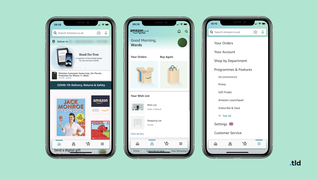
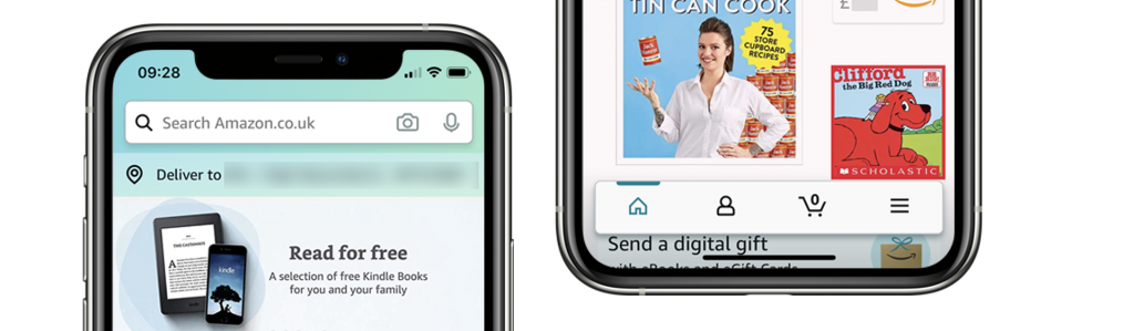
The menu has been re-located and moved into tabs at the bottom. The Home tab brings you to Amazon’s homepage, with announcements, suggestions and recent orders. A new Profile page lets you quickly view recent orders, buy things again and manage your account. The hamburger menu, now a tab, features a new view with options to Shop by Department, access Settings and generally do the same as you could before.
It also sports a fresh new color scheme – a green to blue gradient at the top and green highlights throughout. The animations have been made smoother too.
Whilst the design is still rolling out, user feedback is quite mixed on social media, with some liking it, and the redesign coming as a surprise to some users.
It certainly surprised me, but I really like the new interface. It’s a more modern approach, and I hope Amazon now rolls this out to desktop. I think the product pages are really cluttered, but this hasn’t changed and would be a huge job. Amazon can now focus on refining this design, and their other apps – Ben Ward, Writer
What’s also important to note is that Amazon has not revamped the product pages, or search results. These generally use a web view, and can be updated over-the-air all at once. It’s just the physical interface built into the mobile apps that has changed.
