
Intel has unveiled a brand new, simple logo alongside 11th generation processors at an online event today. The new branding will apply to the company’s products and the parent logo.
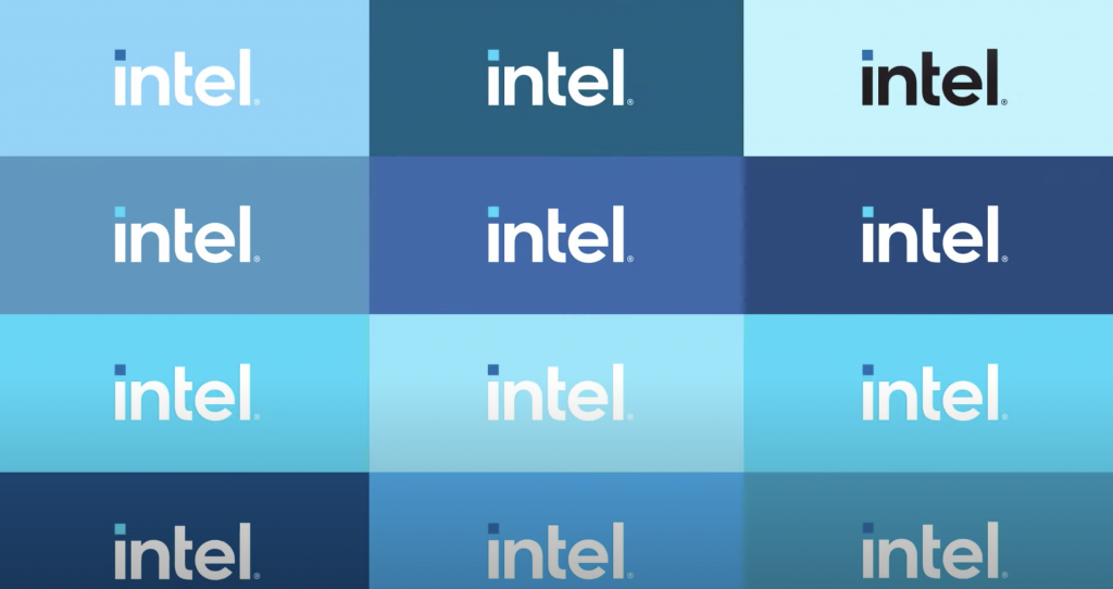
The new design replaces the previous branding that has been used since 2006 and is the third logo that represents the company. It uses a new ‘Intel One’ font with a square-capped ‘i’ carrying a contrasting colour. The curved, circular outline of the previous logo has been removed.
New branding applies to Intel’s Core, Xeon, Evo, Optane, Pentium, Iris and other products too. These introduce the new font with contrasting colours and a simple, minimalistic look.
The new logo represents a dramatic simplification of the Intel brand identity. Crafted with an underlying geometry, the logo has a refine symmetry, balance and proportion that is understated and iconic
Intel
It will feature on 11th-gen processor boxes, stickers and branding. Watch Intel’s introduction to the new brand here.
